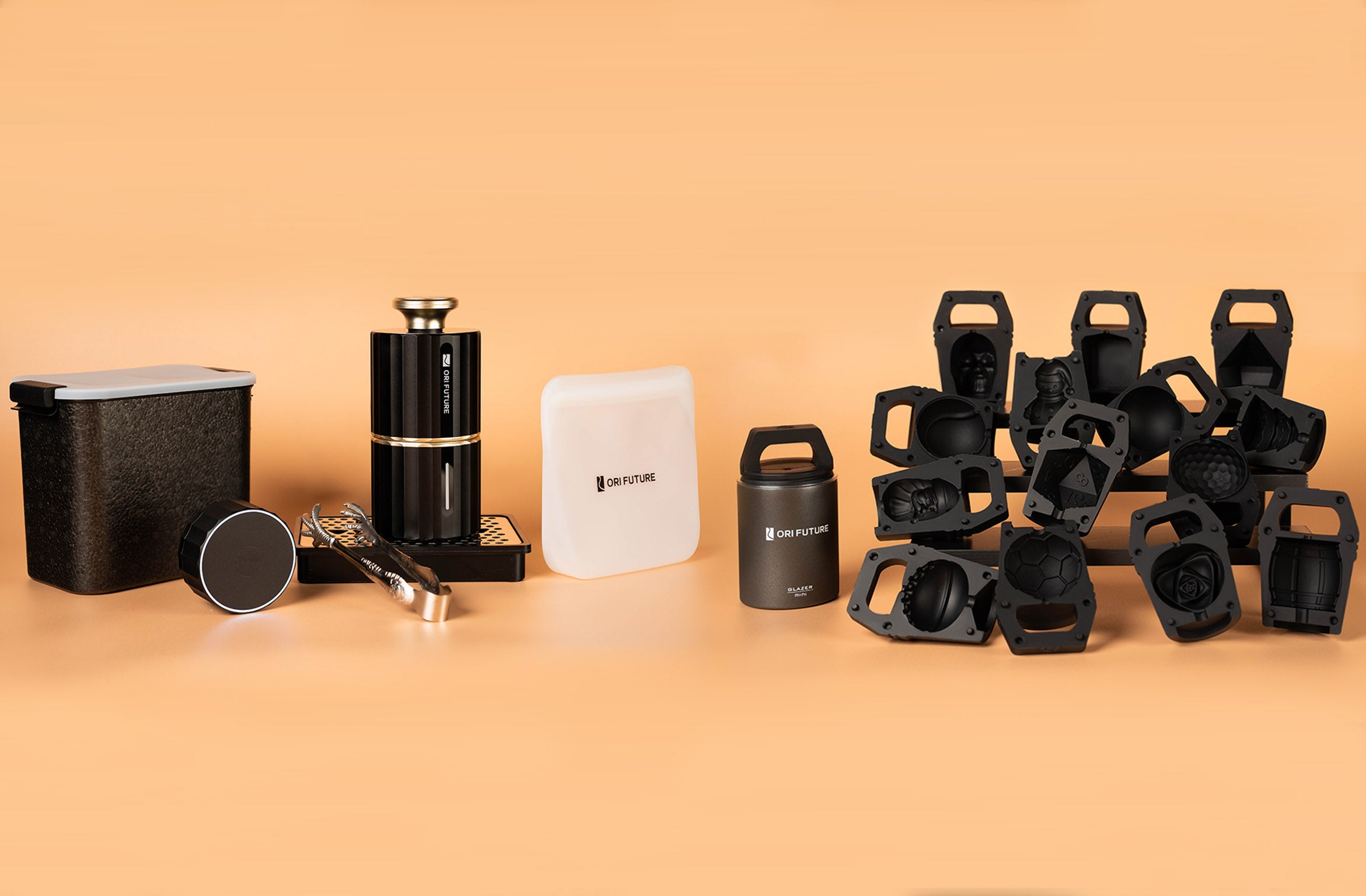
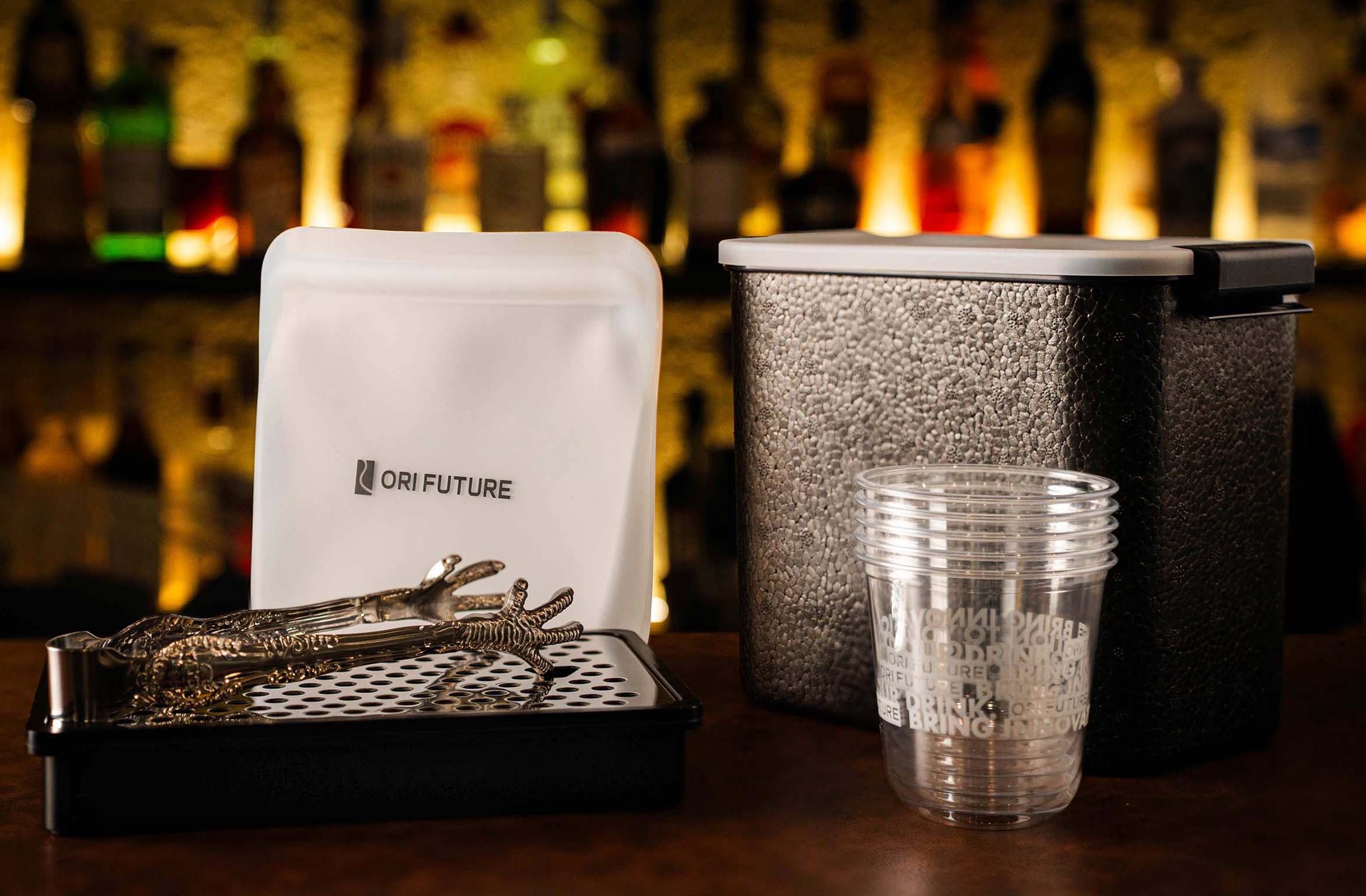
As our project progresses, our designers get started on industrial design. Our second prototype's design reflects technical advancements and our deep consideration of product appearance and user experience.
Compared to the last prototype, the second, still a 3D printed model and not operational, marks a significant design breakthrough, making the product concept more straightforward and appealing. This blog takes you through the design innovation process of it.
From Concept to Visual Representation
In the early design stages, our goal was to convey the product's core ideas and features while ensuring its appearance attracted our target audience, opting for a more modern design language to reflect the product's efficiency and ease of use.
The second prototype features several design innovations:
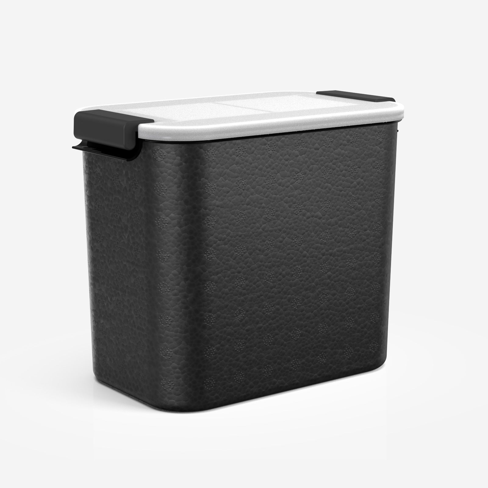
- Exterior Design: We combined ergonomic design and verified the handle size through 3D printing models. Considering the portability of the product. Also, we designed a locking buckle for users to increase portability and adapt to various scenarios.

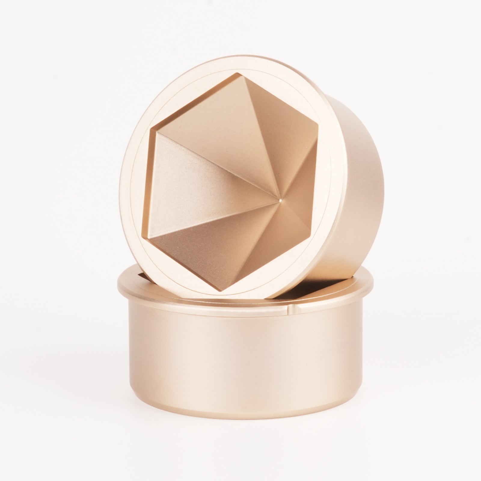
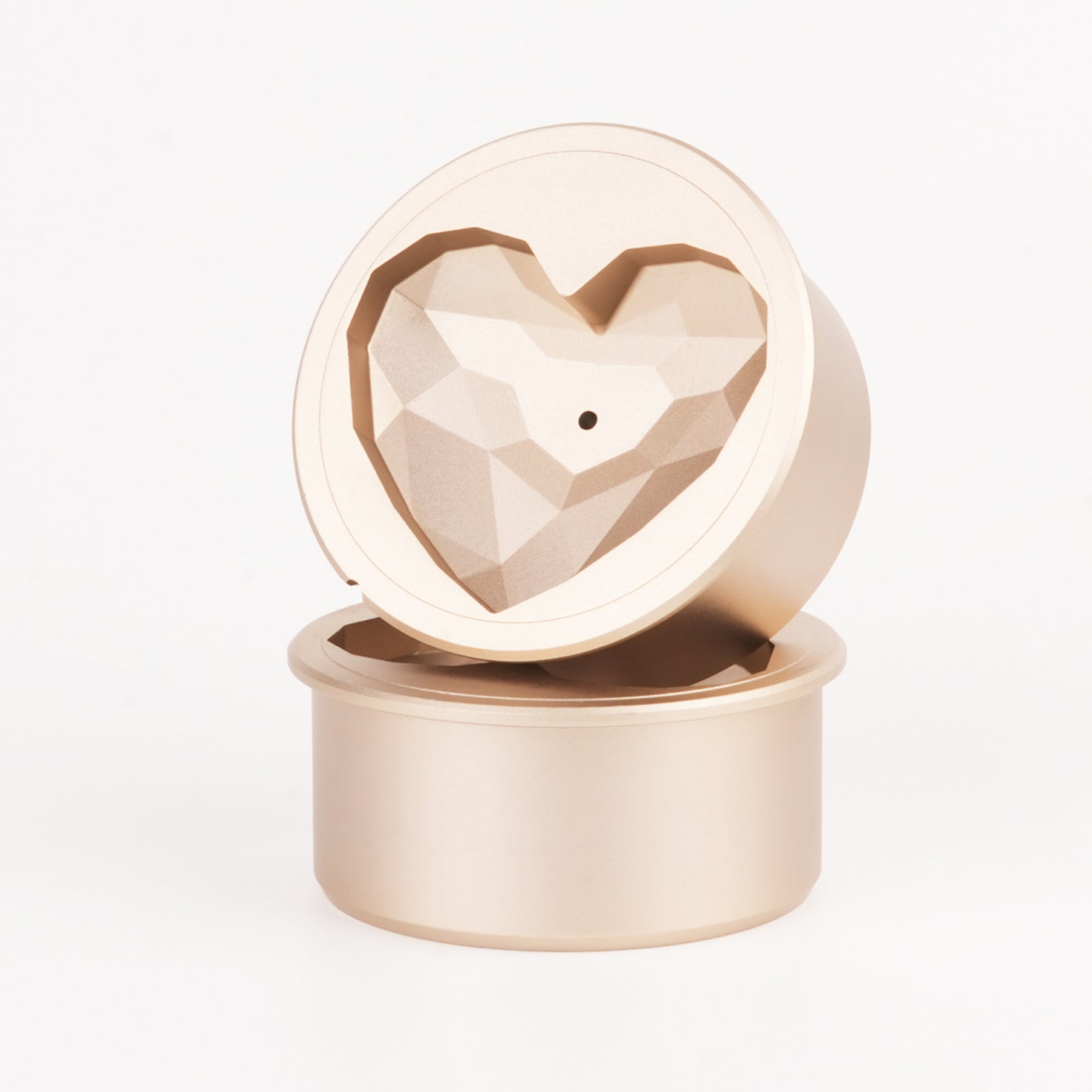
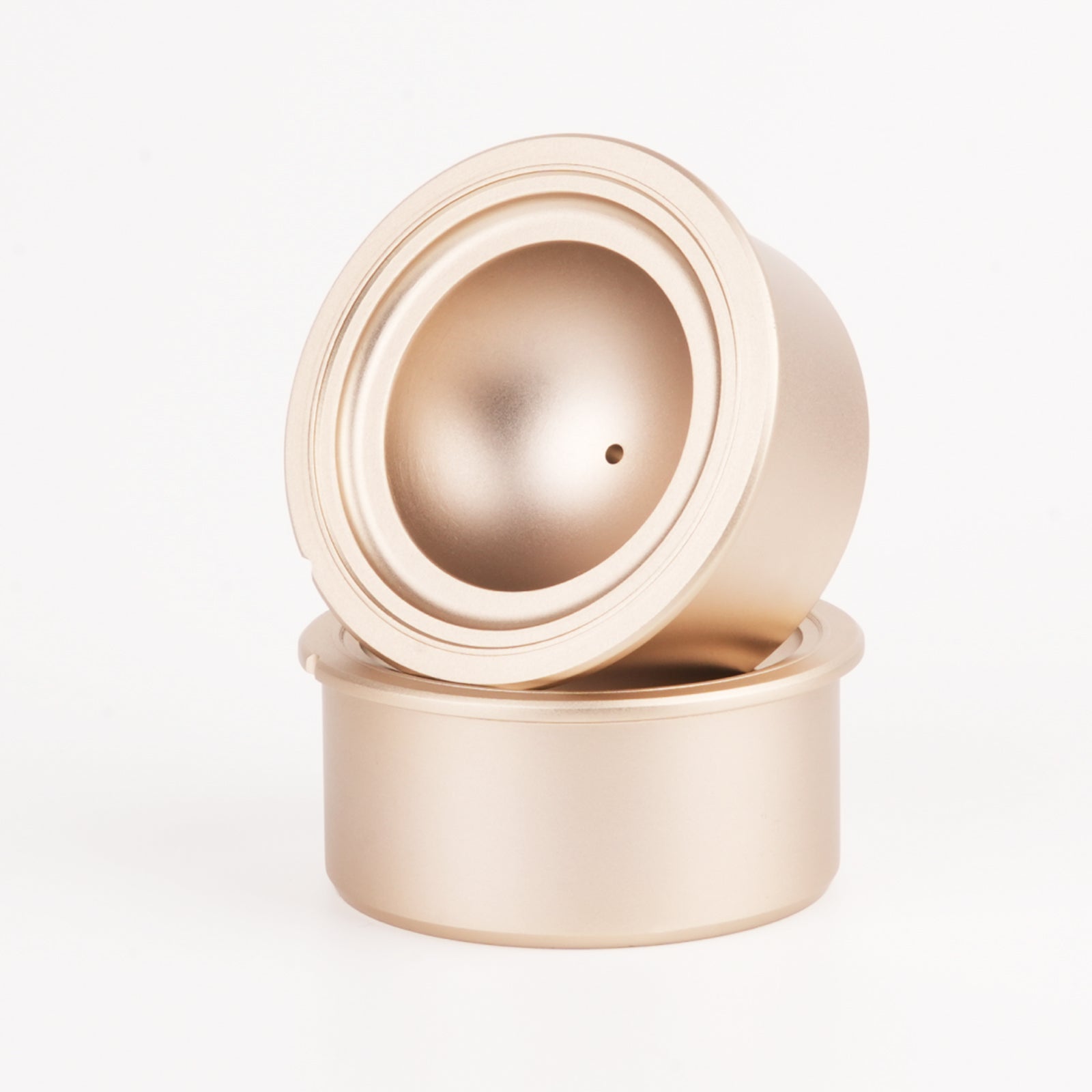
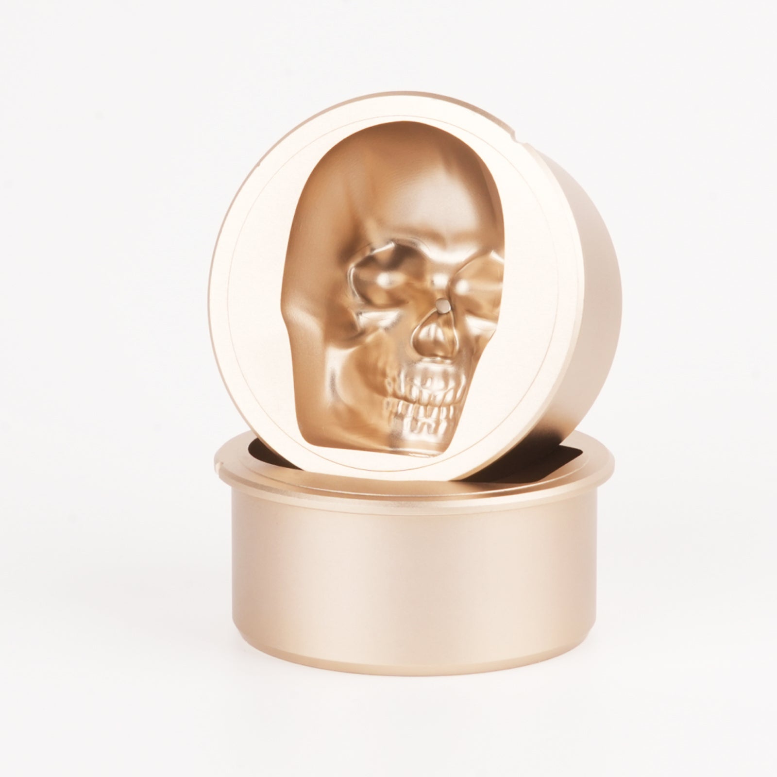
- Color and Material: In terms of color selection, we have proposed a black and gold color scheme, which makes the product more visually impactful and high-end. Regarding material, we used aluminum alloy with a golden color coating for the heating part due to its good thermal conductivity and ease of processing (as shown in the image below). For other parts, we plan to use plastic with injection molding. I admit this will reduce the product's texture, but we now chose to compromise for its cheaper price.

- Detailing: For GLAZER Press, the details to the extreme are our pursuit. In the design of switches and lights, we made a lot of attempts and finally decided to remove the physical button switch and only use lights for interaction, which will make the product easier to operate.
Design Thinking for User Experience

Intuitive lifting structure
Future Outlook
